
How to Use Creative Data Visualization Techniques for Easy Comprehension of Qualitative Research


“A picture is worth a thousand words!”—an adage used so often stands true even whilst reporting your research data. Research studies with overwhelming data can perhaps be difficult to comprehend by some readers or can even be time-consuming. While presenting quantitative research data becomes easier with the help of graphs, pie charts, etc. researchers face an undeniable challenge whilst presenting qualitative research data. In this article, we will elaborate on effectively presenting qualitative research using data visualization techniques.
What is Data Visualization?
Data visualization is the process of converting textual information into graphical and illustrative representations. It is imperative to think beyond numbers to get a holistic and comprehensive understanding of research data. Hence, this technique is adopted to help presenters communicate relevant research data in a way that’s easy for the viewer to interpret and draw conclusions.
What Is the Importance of Data Visualization in Qualitative Research?
According to the form in which the data is collected and expressed, it is broadly divided into qualitative data and quantitative data. Quantitative data expresses the size or quantity of data in a countable integer. Unlike quantitative data, qualitative data cannot be expressed in continuous integer values; it refers to data values described in the non-numeric form related to subjects, places, things, events, activities, or concepts.
What Are the Advantages of Good Data Visualization Techniques?
Excellent data visualization techniques have several benefits:
- Human eyes are often drawn to patterns and colors. Moreover, in this age of Big Data, visualization can be considered an asset to quickly and easily comprehend large amounts of data generated in a research study.
- Enables viewers to recognize emerging trends and accelerate their response time on the basis of what is seen and assimilated.
- Illustrations make it easier to identify correlated parameters.
- Allows the presenter to narrate a story whilst helping the viewer understand the data and draw conclusions from it.
- As humans can process visual images better than texts, data visualization techniques enable viewers to remember them for a longer time.
Different Types of Data Visualization Techniques in Qualitative Research
Here are several data visualization techniques for presenting qualitative data for better comprehension of research data.
1. Word Clouds

- Word Clouds is a type of data visualization technique which helps in visualizing one-word descriptions.
- It is a single image composing multiple words associated with a particular text or subject.
- The size of each word indicates its importance or frequency in the data.
- Wordle and Tagxedo are two majorly used tools to create word clouds.
2. Graphic Timelines
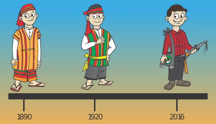
- Graphic timelines are created to present regular text-based timelines with pictorial illustrations or diagrams, photos, and other images.
- It visually displays a series of events in chronological order on a timescale.
- Furthermore, showcasing timelines in a graphical manner makes it easier to understand critical milestones in a study.
3. Icons Beside Descriptions
![]()
- Rather than writing long descriptive paragraphs, including resembling icons beside brief and concise points enable quick and easy comprehension.
4. Heat Map
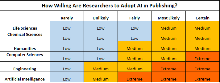
- Using a heat map as a data visualization technique better displays differences in data with color variations.
- The intensity and frequency of data is well addressed with the help of these color codes.
- However, a clear legend must be mentioned alongside the heat map to correctly interpret a heat map.
- Additionally, it also helps identify trends in data.
5. Mind Map

- A mind map helps explain concepts and ideas linked to a central idea.
- Allows visual structuring of ideas without overwhelming the viewer with large amounts of text.
- These can be used to present graphical abstracts
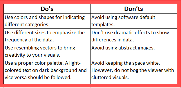
Do’s and Don’ts of Data Visualization Techniques
It perhaps is not easy to visualize qualitative data and make it recognizable and comprehensible to viewers at a glance. However, well-visualized qualitative data can be very useful in order to clearly convey the key points to readers and listeners in presentations.
Are you struggling with ways to display your qualitative data? Which data visualization techniques have you used before? Let us know about your experience in the comments section below!


nicely explained
None. And I want to use it from now.
Would it be ideal or suggested to use these techniques to display qualitative data in a thesis perhaps?
Using data visualization techniques in a qualitative research thesis can help convey your findings in a more engaging and comprehensible manner. Here’s a brief overview of how to incorporate data visualization in such a thesis:
Select Relevant Visualizations:
Identify the types of data you have (e.g., textual, audio, visual) and the appropriate visualization techniques that can represent your qualitative data effectively. Common options include word clouds, charts, graphs, timelines, and thematic maps.
Data Preparation:
Ensure your qualitative data is well-organized and coded appropriately. This might involve using qualitative analysis software like NVivo or Atlas.ti to tag and categorize data.
Create Visualizations:
Generate visualizations that illustrate key themes, patterns, or trends within your qualitative data. For example:
Word clouds can highlight frequently occurring terms or concepts.
Bar charts or histograms can show the distribution of specific themes or categories.
Timeline visualizations can help display chronological trends.
Concept maps can illustrate the relationships between different concepts or ideas.
Integrate Visualizations into Your Thesis:
Incorporate these visualizations within your thesis to complement your narrative. Place them strategically to support your arguments or findings.
Include clear and concise captions and labels for each visualization, providing context and explaining their significance.
Interpretation:
In the text of your thesis, interpret the visualizations. Explain what patterns or insights they reveal about your qualitative data. Offer meaningful insights and connections between the visuals and your research questions or hypotheses.
Maintain Consistency:
Maintain a consistent style and formatting for your visualizations throughout the thesis. This ensures clarity and professionalism.
Ethical Considerations:
If your qualitative research involves sensitive or personal data, consider ethical guidelines and privacy concerns when presenting visualizations. Anonymize or protect sensitive information as needed.
Review and Refinement:
Before finalizing your thesis, review the visualizations for accuracy and clarity. Seek feedback from peers or advisors to ensure they effectively convey your qualitative findings.
Appendices:
If you have a large number of visualizations or detailed data, consider placing some in appendices. This keeps the main body of your thesis uncluttered while providing interested readers with supplementary information.
Cite Sources:
If you use specific software or tools to create your visualizations, acknowledge and cite them appropriately in your thesis.
Hope you find this helpful. Happy Learning!