


A graphical abstract is used to sum up a manuscript’s results in one neat little package so that the person reading the research paper can see the results at a glance without having to read through the entire text. Even though most scientific papers hold abstracts to a 250-word maximum (some academic journals require even less), many readers just want the facts presented clearly in a concise visual representation. Graphics are now becoming popular as replacements for abstract text. Graphical abstracts help readers to quickly understand an article and determine whether it is relevant to their interest or research without having to read through it; however, there are some who believe that graphics can be confusing or misleading without text to explain them. That’s why it is important to ensure that any graphics used to replace text is clear and complete.
Communicate Clearly with Graphics
When planning to use a graphic instead of text for your abstracts, keep in mind that the graphic should not just be a copy of one that is inserted in the text. Often, these represent only a piece of information discussed at a time and not an entire visual representation of the paper. A visual summary should be designed specifically for the abstract and should clearly communicate the “technical details of the study.” One of the largest publishers of scientific journals, Elsevier, now provides authors with detailed instructions on how to submit their graphical abstracts. According to Elsevier, the graphical abstract should “allow readers to quickly gain an understanding of the main take-home message of the paper and is intended to encourage browsing, promote interdisciplinary scholarship, and help readers identify more quickly which papers are most relevant to their research interests.”
In a 2012 article in Nature Chemistry, the author discusses that some chemistry journals have used graphical abstracts for years, but that other scientific journals had not yet joined the trend. In a 2010 article, Elsevier announced its new “Article of the Future” format that began as a demonstration prototype and evolved into an “ongoing collaboration with the scientific community.” Through Elsevier’s then newly–created Cell Press journals, articles were to be published online in a new format, which included graphical abstracts and a “reviewable visual summary and bullet points.” The goal of the new online format was to improve formal scientific communication by enhancing article presentation. Graphical abstracts help realize this goal.
Author Resistance
According to a 2015 article reprinted in Wiley from the International Society of Managing and Technical Editors (ISMTE), most authors are familiar with the concept of a graphical abstract but might not receive enough information from their target journals on its purpose and how to construct it. For many researchers, graphical abstracts represent more work. After months or years of research and collecting and analyzing data, they might not be willing to spend yet more time on creating a graphic for what they might see as a “lazy reader” of their work.
If authors consider graphical abstracts in a different light, they might see them as a better opportunity to reach more people. With online publishing, the graphic is presented so that those searching for an article will see a clear pictorial representation of the subject matter. This representation might not only be a good marketing tool for the researcher, but also a “chance to capture the audience’s attention, making them so interested that they want to read more.”
Even more disconcerting to researchers are the results of a 2016 study published in Molecules that did not consider graphical abstracts as being much more valuable than those without graphics. The authors evaluated 566 manuscripts with graphical abstracts and 760 without graphical abstracts published in Molecules between March 2014 and March 2015. The study found that those without graphical abstracts performed better in terms of PDF downloads, abstract views, and total citations than those with graphical abstracts. However, that study was limited not only by the timeframe used, but also in coverage of manuscripts published in only one journal, and suggested that much larger studies would be needed to validate the findings. Regardless of these findings, innovative scientists should take note of the new trend and consider adopting innovative ways to present research findings.
Design Considerations
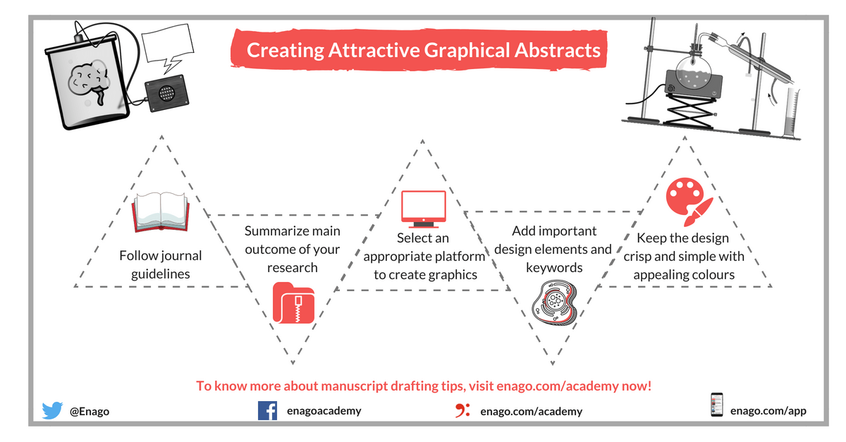
When including a graphical abstract in your presentation, there are some tips on the design that will make your life much easier. The study noted above indicated some “cons” of using these graphics; however, much of the downside had to do with the difficulty in having the research published in pdf format and how graphics didn’t always translate well in that format. New technology can resolve this issue, and there are some main tips to remember when designing your graphics for publication.
To make a good graphical abstract, consider the following:
- Sum up the main outcome/idea of your research in a simple form
- Know your target audience
- Take tips from good graphical abstract examples
- Start with a sketch to know the important elements of your message
- Follow the guidelines of your target journal
- Make it appealing and effective with the use of colors and imagery
- Select an appropriate platform to create your graphics
- Use key phrases or keywords
- Keep the design crisp and easy to understand
- Be mindful of the image quality in terms of pixels
Your target journal will most likely have a set of guidelines on the format of your graphic, and those who publish online might allow you to be even more creative in providing more interactive graphics. Remember that although graphical abstracts might appear to be extra work, you already have all the information you need to create something that could be valuable to you as a researcher. Have you ever prepared a graphical abstract for a journal manuscript? Which software programs have you used for this purpose? Please share your advice in the comments section below.


Great overview. But would like to see some guidelines used by IEEE, others for GAs that are more “representational” than explanatory.