


Box charts and box plots are often used to visually represent research data. Therefore, it is important to understand the difference between the two. The use of box plot vs. box chart depends on the nature of data and the interpretation a researcher would like to convey.
Box Plots and How to Read Them
The box plot is used to plot the distribution of a data set. Box plots are also known as box-and-whiskers plots. These graphs encode five characteristics of distribution of data by showing the reader their position and length. The box ranges from Q1 (the first quartile) to Q3 (the third quartile) of the distribution and the range represents the IQR (interquartile range). The median is indicated by a line across the box. The “whiskers” on box plots extend from Q1 and Q3 to the most extreme data points. In turn, each of these outliers is represented by a mark. Alternatively, the maximum and minimum values can be used as endpoints for the “whiskers.”
Related: Creating tables and figures for your manuscript? Get personalized solutions on the FREE Q&A Forum!
Reading box plots is not as complex as it may seem. The median, represented by a line across the box, is the middle of the data set. It means that 50% of the data is greater than the median. Top “whisker” represents the values higher than the median. Outliers are dots above the top “whisker.” A similar interpretation applies to bottom “whisker” and outliers Box plots can also represent the skews in the data set. The position of the median on the box shows you how much data fall above or below it.
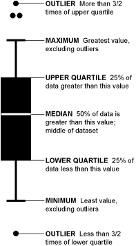
Image credits: Nathan Yau from Flowing Data
Bar Charts and How to Read Them
Bar charts are designed to represent categorical variables and are suitable for counts. Bar charts display and compare frequency, number, or other measures (e.g. mean) for different data categories. However, continuous data from laboratory research, human studies, and animal studies are often represented using bar charts. Bar charts are commonly used graphs because they are easy to interpret and simple to create. They are useful for displaying nominal or ordinal categories. Ordinal categories are data that are ranked (e.g. very good to very poor), while nominal data represent qualitative or descriptive data (e.g. country of birth, subject studied at university). There are different types of bar charts, such as horizontal bar charts, grouped bar charts and stacked bar charts. Researchers should create their graphs by observing a few rules to represent their artwork in a clear and effective way.
Interpreting bar charts starts with observing the height of the bar against the corresponding value on the y-axis. The differences in the heights of the bars can be determined by referring to the y-axis. The second step is to compare the groupings of the bars. Some bar charts may have bars grouped into clusters. In this case, compare the bars within the clusters to understand how each data set within a subcategory compares to other data sets. Moreover, you can also check the range by subtracting the lowest value (denoted by the shortest bar) from the highest value (denoted by the longest bar).
Which One Should You Use?
What type of data will you represent? How do you want to represent your data? You need to answer such questions before choosing between the two.
Some authors argue that bar charts should not be used while others state that new formats to represent data should emerge. Grouped bar charts are useful for showing the budgets for two households, for instance. One common use of bar charts is to show the proportion of one value against another.
On the other hand, box plots are useful for plotting various data sets from independent sources. An example includes test scores between different universities, change in data (before and after) due to a process, or data from different machines manufacturing the same product. Box plots are good ways to represent the distribution of your data, especially if you are aiming to show other values besides the mean.
Tying Up Your Research Data
It is straightforward once you decide which type of graph best suits your data. For instance, if your data is skewed, a box plot can be used. Your reader will be able to tell whether the data is skewed to the left or to the right, depending on the length of the bar above and below the median line. Data from ANOVA can also be shown using a box plot. If your data is primarily descriptive and you want to show proportions, then a bar chart is your best bet.
Whichever way you choose, it is important to understand the utility of these graphs. Your research data analysis is the main part of your research report it effectively! Let us know what you think about the use of box plot and box chart when reporting your results!