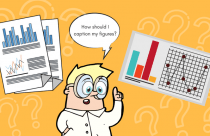


For a scientific image to be effective, its meaning must be readily understood. There are three main areas to consider when constructing a graphic image to accurately represent textual data:
- Clear Messaging
- Uncluttered Graphics
- Color Choice
Scientific images or figures represent textual data in a concise, visual manner. However, prior to designing a graphic representation of the material, the author must decide what information is crucial and how best to convey that visually. In order for the message to be clear, the graphic must be uncluttered by extraneous material. Edward Tutfe1 calls this extraneous material “chartjunk”. In addition, color choice can be the difference between a readable and a confusing image.
Color Blind-sensitive Scientific Images
In the United States alone, color blindness affects as many as 8% of men and 0.5% of women—more than 13 million people. The most common form is called “protanopia,” which is the form of color blindness characterized by defective perception of red and confusion of red with green or bluish green. Other forms of color blindness affect the perception of green & brown, blue & purple, green & blue, light green & yellow, blue & gray, green & gray, and green & black.
Authors Masataka Okabe and Kei Ito (both of whom are affected by protanopia) in their article, provide excellent visual representations of how certain colors are perceived by those with color blindness. An example of this would be the common usage of the color red to highlight important information in graphs, charts, and other images. However, if red appears as a brownish color to a reader with color blindness, it certainly won’t have the same impact or communicate the same message. Therefore, with so many readers potentially affected by some form of color distortion, the academic publishing community should make color modifications a general practice.
Fortunately, there are many tools to assist scientists and researchers with the creation of effective images. A logical start would be to understand color palettes and how they affect the reader. Brewer palettes were designed by Cynthia Brewer for use in cartography, but the field of data visualization has adopted them as well. These palettes organize color in a way that helps the user determine which colors will appear similar and which will appear as contrasting.
Martin Krzywinski has taken the Brewer palettes and created 15-color palettes for color blindness for each of the three common types of color blindness. In addition, within their article, Nicholas Rougier, Michael Droettboom, and Philip E. Bourne list some open source tools that can assist in the development of colorblind-sensitive scientific images:
- Matplotlib
- R
- Inkscape
- TiKZ & PGF
- GIMP
- ImageMagick
- D3.js
- Cytoscape
- Circos
Preparing Figures and Images
They also list ten fundamental components of an effective scientific image or figure:
- Know your target audience
- Identify your message to be conveyed
- Adapt the figure to support the medium
- Captions should not be considered as optional
- Do not rely on the defaults
- Make use color effectively
- Do not misguide the reader
- Try avoiding “Chartjunk”
- Message trumps beauty
- Get the right tool
However, it is important to know that the basic elements of clarity and purpose are at the root of each. The reason scientists and researchers use graphics to represent their work is so that the reader can grasp the material quickly and easily. Anything that interferes with or distorts the message should be eliminated. Okabe and Ito also offer some concise guidance when it comes to preparing figures and images. Focusing on the use of color, they call this “3 (+1) Principles of Color Universal Design”:
- Choose proper color schemes that are easily identified by everyone taking into consideration the actual lighting conditions and usage environment
- Use different colors along with a combination of different shapes, positions, line types, and coloring patterns to ensure that the information is easily conveyed to all users.
- Clearly state color names where users are expected to use color names in communication
(+1). Aim for visually friendly and beautiful designs
Function + Design = Potent Scientific Images
Taking into consideration the basic rules of figure design and merging them with considerations for those with color perception issues will result in a potent scientific image. Used wisely and efficiently, color, varying typeface, highlighting, textures and patterns, simple bolding or italicizing, and identifying the proper format for the audience and environment will serve both the author and reader well. The message must be paramount to the design and the design must serve the message.
References
- Edward R. Tufte (1983) The Visual Display of Quantitative Information. Retrieved from https://pdfs.semanticscholar.org/c042/2a29881fc1fdc7021f5e8f9f042e5dee2c57.pdf
- Masataka Okabe & Kei Ito (2008, February 15)Color Universal Design (CUD) – How to make figures and presentations that are friendly to Colorblind people. Retrieved from http://jfly.iam.u-tokyo.ac.jp/color/#top
- Nicolas P. Rougier, Michael Droettboom, Philip E. Bourne (2014, September 11) Ten Simple Rules for Better Figures. Retrieved from http://journals.plos.org/ploscompbiol/article?id=10.1371/journal.pcbi.1003833
- Luk (2015, January 17) A simple strategy to bring focus to your scientific figures. Retrieved from http://www.somersault1824.com/a-simple-strategy-to-bring-focus-to-your-scientific-figures/
- Luk (2015, February 15) Don’t let color distort the meaning of the underlying data. Retrieved from http://www.somersault1824.com/dont-let-color-distort-the-meaning-of-the-underlying-data/