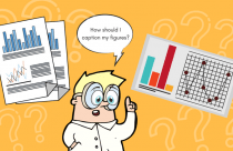


There are many useful ways to present your research data to editors, referees, and readers. Tables and figures are particularly effective when large amounts of information have to be presented and discussed in an effective way. In fact, many journal editors and reviewers take a quick look at all the figures and tables in a manuscript before they actually start to review it.
In some cases, using too much text can be confusing and exhausting, so summarizing your data in a visual form—including tables, line graphs, pie charts, scatter plots, and others—can be very helpful. It allows you to present your results in a consolidated manner and helps readers to get an overview of the most important findings of your work without having to go through the entire manuscript. However, too many visuals can interrupt the flow of the text, so it is important to include tables and figures prudentially, without overusing them. The best scientific papers are always a good combination of written and visual information.
Deciding When to Use Visuals
There are a few points that can help you decide when to use tables and graphics. The main reason for introducing visuals in a manuscript is clarity: some information can be better understood if explained visually. The information, thus, has to be qualitatively or quantitatively measurable to be included in a table or a graph.
Other reasons are summarization (great amount of information can be compiled in a single graphic or table) and comparison (diagrams, tables, and graphics are an excellent way to expose the differences between various parameters or subjects).
Which Format Works Best?
In general, large sets of numerical data should not be included in the text of a manuscript but rather summarized in tables or graphics. While tables are an excellent tool for giving structured numerical information, graphics are more appropriate for demonstrating trends and relationships or making comparisons.
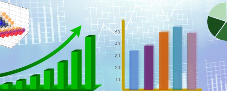
Different formats that can be used to represent data.
- Pie charts can be created to show parts of the whole data and are suitable for emphasizing general findings. This format works well to summarize percentage results, including those obtained in geographical studies or surveys, or to communicate simple ideas such as market shares.
- Bar graphs can display non-continuous (discrete) data and are a great tool for direct comparisons. They are often used to present frequency observations, such as the preferred mode of transportation or the most popular university course. They are also good for displaying financial information or illustrating any breakdown of data over time —for example, the number of products sold by the month. For continuous random variables, a different kind of graph —called a histogram— is required.
- Line graphs are commonly used to display time series data. They are more effective than bar graphs in presenting five or more data points, but less effective in emphasizing differences over few periods of time.
- Scatter plots are used to show the correlations between two sets of data, for example, between height and weight, costs and production, or advertising and sales.
- Tables are the best way to present data for reference purposes and can include very complex information. This type of information can be presented clearly by using an appropriate label and displaying the data in suitable groups (sorted in columns and rows).
Adding visual information to your paper can considerably enhance its impact and readability. So, take some time to make the right decision considering all the tools available and the story you want to tell.