


Visual summaries are now a mainstream element of scholarly publishing. Dozens of major journals request or encourage a graphical abstract at submission, and more than 100 journals and institutions have adopted visual-abstract strategies for dissemination. Adding a well-designed visual summary to social-media posts or article pages increases attention and click-throughs, making the graphical abstract both a discovery tool and a communication device.
This article reviews the major design approaches and structural styles for graphical abstracts, explains how each style communicates scientific information, and provides practical guidance for selecting the most effective design based on journal guidelines, discipline norms, and article type. The sections below cover:
- Principal graphical-abstract styles
- How design choices shape comprehension
- A decision framework for selecting a style
- Design workflow and checklist
- Common pitfalls to avoid
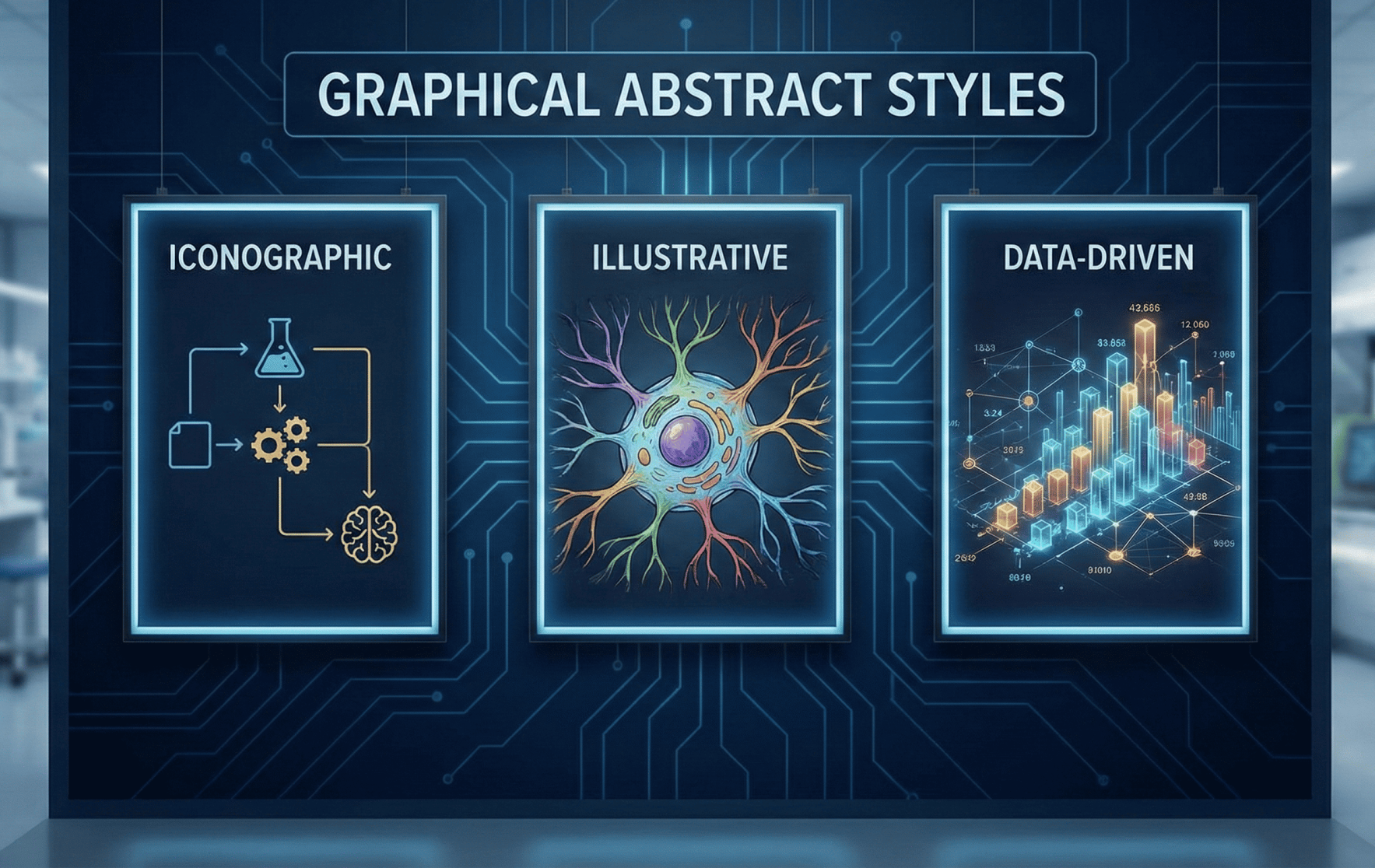
What a Graphical Abstract Is and the Major Style Families
A graphical abstract (also called a visual abstract) is a single-image summary that communicates the key question, methods, and take-home finding of a research article at a glance. Because there is no universal standard, several dominant visual frameworks have emerged. The most common style families are outlined below.
- Schematic / Diagram
This style uses scientific diagrams, pathway maps, or stepwise schematics to represent mechanisms, workflows, or experimental setups. It is best suited to specialist readers who understand disciplinary notation and conventions and is common in chemistry, molecular biology, and engineering.
Schematic abstracts minimize narrative text and rely on standardized symbols and concise labels.
- Visual Abstract (Templated Medical Style)
Originating in clinical journals, this compact and modular style uses a consistent layout typically a title, one or a few key numeric results, and corresponding icons—to enable rapid scanning. Visual abstracts are optimized for social-media distribution (especially X/Twitter and LinkedIn).
Controlled studies report substantial increases in impressions, retweets, and article visits when visual abstracts accompany social-media posts.
- Infographic
Infographics combine images, charts, icons, and short annotated text to tell a concise narrative. They are visually rich and effective for interdisciplinary audiences or public communication.
This style is frequently used for press releases and outreach because it allows authors to provide context alongside results without overwhelming the reader.
- Comic / Lay Summary
This approachable format uses simplified illustrations and sequential panels to communicate research to non-expert audiences. It emphasizes accessibility and engagement over technical depth and is most appropriate for outreach and education rather than specialist discovery.
How Each Style Communicates Scientific Information
Graphical abstracts communicate information through three primary mechanisms: visual hierarchy, narrative flow, and data encoding.
Visual Hierarchy: What Grabs Attention First
Size, color contrast, and placement guide the viewer’s attention to the main message usually the primary finding or conceptual model. Placing the key outcome or numerical result centrally ensures it is seen before secondary details.
Guidelines such as the Ten Simple Rules for Graphical Abstracts emphasize clarity of the core message and avoidance of visual clutter.
Narrative Flow: How the Reader Moves Through the Image
A clear left-to-right or top-to-bottom progression helps readers quickly understand cause-and-effect relationships. Many publishers advise a defined start and end so the graphical abstract reads like a single slide of a story. This is particularly important for workflow- or methods-driven studies.
Data Encoding: How Numbers and Uncertainty Are Shown
Quantitative results should be conveyed using concise numeric labels, small charts, or icons paired with effect sizes and uncertainty indicators. Dense tables and complex axes reduce clarity. For clinical or policy-relevant findings, simple p-values, percentages, or effect icons convey significance without overwhelming the viewer.
Choosing the Right Style: Journal, Discipline, and Article Type
Style selection should follow three sequential checks:
- Consult Journal Guidelines First
Many publishers specify size, resolution, file type, and text limits for graphical abstracts. Elsevier, for example, provides detailed pixel and resolution guidance and requires a separate image file with a clear narrative flow. Failure to meet technical requirements can delay processing or require redesign.
- Respect Discipline Norms
Disciplinary conventions matter. In chemistry or structural biology, schematic diagrams efficiently communicate mechanisms. In clinical medicine, templated visual abstracts emphasizing numerical outcomes and sample size are standard.
For interdisciplinary journals, a hybrid infographic often balances rapid comprehension with sufficient technical detail.
- Match the Style to the Article Type
- Experimental or mechanistic studies: concise schematics or workflows
- Randomized trials or meta-analyses: numeric displays (effect sizes, sample sizes)
- Methods papers: stepwise flowcharts highlighting novelty
Many journals require graphical abstracts to be original, self-explanatory, and focused on a single take-home message.
A Practical Design Workflow and Checklist
Pre-Design
- Review journal specifications (size, file type, text limits)
- Identify one core message and two supporting elements
- Sketch a one-slide storyboard to define narrative flow
Design
- Select a style aligned with audience and article type
- Use consistent icons, a limited color palette, and readable fonts
- Encode data with numeric callouts or mini-charts rather than tables
Review and Finalize
- Verify accuracy against the manuscript (no new claims)
- Confirm resolution, file format, and image permissions
- Save editable source files (AI, PSD, PPTX) for revisions
Accuracy and design audits show errors are common, reinforcing the need for careful verification.
Design Tips, Accessibility, and AI Considerations
Use color to group related elements rather than decorate. Limit text to labels and short phrases. Test color choices for accessibility, particularly red–green contrast.
When using AI-assisted design tools, follow journal policies and verify scientific accuracy. Publishers increasingly require transparency about AI use.
Common Mistakes and How to Avoid Them
Common issues include overcrowding visuals with raw data, duplicating figure panels without simplification, and violating resolution or format requirements. Accuracy errors such as missing sample sizes or mislabelled study designs—undermine trust and may require correction.
Assessment tools and audits consistently highlight the need for careful cross-checking before submission.
Applying Evidence to Practice: What the Research Shows
Controlled and crossover studies demonstrate that visual abstracts increase social-media engagement and article visits, although effect sizes vary by journal and execution quality. Early landmark studies showed large gains; later trials report more moderate but still positive effects as visual abstracts become widespread.
These findings reinforce the importance of thoughtful design rather than treating visuals as promotional shortcuts.
Conclusion and Next Steps
A graphical abstract is both a submission requirement and a dissemination asset. Selecting the right style and executing it carefully can improve discoverability while maintaining scientific accuracy.
Authors should begin with journal guidance, choose a style aligned with audience and article type, and follow a simple storyboard–design–verify workflow. For those seeking support, professional services can assist with journal-compliant design, subject-matter review, and final-format delivery. Enago’s graphical abstract and research impact services combine design with subject-expert review to meet journal requirements and align visual and textual messages.

Frequently Asked Questions
What is a graphical abstract in scholarly publishing?▼
A graphical abstract is a single visual that summarizes a paper’s key question, method, and main finding at a glance.
What are the main types of graphical abstract styles?▼
Common styles include schematic diagrams, templated visual abstracts, infographics, and lay or comic-style summaries.
How do I choose the right graphical abstract style for my paper?▼
The best style depends on journal guidelines, discipline norms, and whether the article emphasizes mechanisms, data, or outcomes.
Do journals require graphical abstracts at submission?▼
Many journals request or encourage graphical abstracts, and some make them mandatory with specific size and format rules.
How do graphical abstracts improve article visibility?▼
Well-designed graphical abstracts increase attention, social-media engagement, and article click-through rates.
What are common mistakes in graphical abstract design?▼
Frequent errors include overcrowding visuals, unclear narratives, low resolution, and mismatches with journal specifications.